Day 2: Designing the Future — Building a Stunning UI with MagicUI and Shadcn/UI

Designing the Future: Building a Stunning UI with MagicUI and Shadcn/UI
📢 If you haven't read the first part of our 7 Days Website Revamp series, check it out here: Day 1: Embracing Next.js — The Foundation of Our Website Revamp
📚 You can also explore all posts from the 7 Days Website Revamp series to follow along!
Why We Chose a Component Library Strategy
While rebuilding the atWare Vietnam website, our goal was to craft a UI system that was both scalable and visually appealing. Instead of creating every component from the ground up, we leveraged two well-maintained open-source libraries that worked seamlessly together:
- Shadcn/UI for core component architecture
- MagicUI for refined visual enhancements
This approach enabled us to maintain efficiency without compromising on delivering a sleek, polished frontend experience.
Shadcn/UI for Core, Extensible Components
We selected Shadcn/UI as the foundation of our component system. It provided all the basics we needed:
- Buttons
- Inputs
- Forms
- Modals
- Dialogs
- Tabs and Menus
Its biggest strength is that it's headless but styled, allowing us to easily adopt the code and adjust it to match our brand. The components are built on Radix UI, making them accessible, composable, and production-ready.
To keep our project organized and scalable, we structured these components within a dedicated /components/ui folder, placing consistency and reusability at the core of our development workflow.
Benefits of using Shadcn/UI:
- Fully extensible – complete control over the source code
- Easy to theme with Tailwind
- Clean, accessible defaults right out of the box
- Great community and ongoing updates
Installing Shadcn/UI
We started by installing the CLI and initializing Shadcn/UI in our project. The official installation guide can be found here.
To initialize, we ran:
npx shadcn-ui@latest init
This command walks through a series of prompts regarding the framework (we selected Next.js), Tailwind setup, directory structure, and more.
In most cases, we went with the default options and designated /components/ui as the base directory for UI components.
Once initialized, we were able to add components individually.
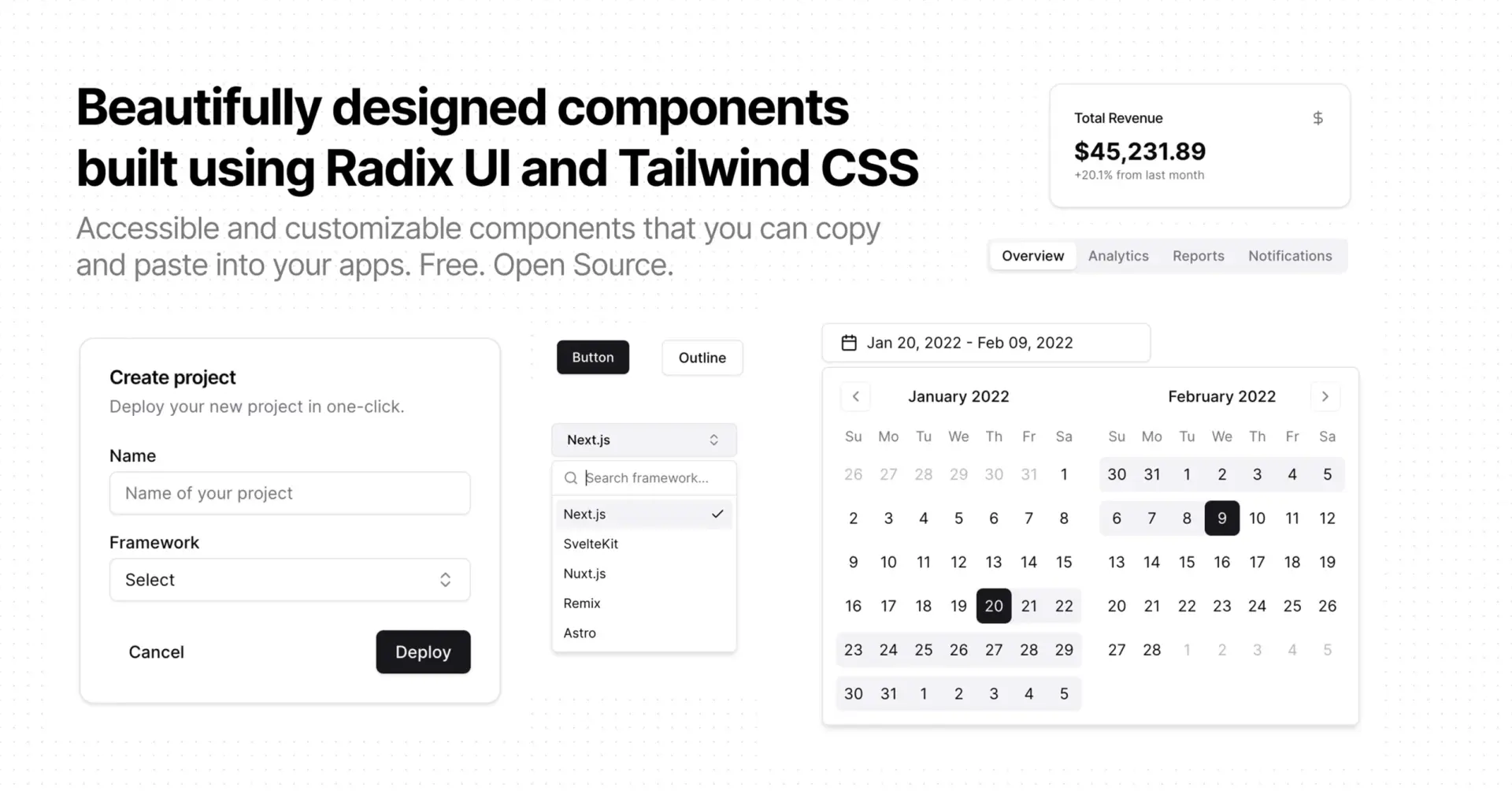
For example, to add a Navigation Menu component, we ran:
npx shadcn@latest add navigation-menu
This generated a fully usable, themeable navigation menu component in our project, which we later customized to create the Header component used in our atWare website. With a few adjustments and by integrating it with our existing site content, we crafted the final Header design shown below.

MagicUI for Visual Polish and Dynamic Layouts
To make our website stand out visually, we integrated MagicUI — a component library designed for beautiful effects and motion.
We used MagicUI primarily for:
- AuroraText: gradient glowing headlines
- BentoGrid: interactive grid layouts for showcasing blogs or features
- GradientBackground and Spotlight: adding motion to sections
- and many other things
MagicUI brought subtle animation and rich visuals that paired nicely with our minimal Shadcn-based structure.
We placed these higher-level components in a /components/magicui folder to keep it separate from foundational UI.
Why MagicUI Was a Great Fit:
- Gorgeous defaults with minimal config
- Lightweight and performant
- Created a sense of depth without clutter
- Easy to integrate alongside Tailwind and Shadcn/UI
Installing MagicUI and Adding Components
MagicUI follows the exact same installation process as Shadcn/UI. There is no separate package or Tailwind configuration required. The official installation guide for MagicUI can be found here.
To add a MagicUI component, we simply used the Shadcn/UI CLI with a remote URL.
For example, to add the BentoGrid component, we ran:
npx shadcn@latest add "https://magicui.design/r/bento-grid"
This command fetched the BentoGrid component and placed it into our /components/magicui folder, ready to use.
We could then import and render it directly in our pages:
import { BentoGrid } from "@/components/magicui/bento-grid";

export default function Home() {
  return (
    <div>
      <BentoGrid />
    </div>
  );
}
This method allowed us to quickly integrate beautiful, pre-built components into our project with minimal setup, keeping our workflow fast and consistent.
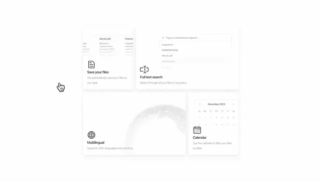
With some custom styling and content adjustments, we used the BentoGrid component to showcase featured sections on the atWare Vietnam website.
Below is an example of how we implemented BentoGrid in our production environment.

Developer Workflow + Preview
Using these two libraries in tandem gave us speed and flexibility. We could quickly scaffold layouts using Shadcn/UI, and then add MagicUI touches to make each page feel dynamic and alive.

Next up, dive into Day 3: Seamless Deployment — Hosting on Lightsail Container Service and Automating with GitHub Actions, where we cover how we deployed our Next.js site using AWS Lightsail Container Service, Terraform, and GitHub Actions.
📚 All posts from the 7 Days Website Revamp series are now live — explore the full series to follow our journey!