Optimizing a Marine Data Platform: UI, Performance & User Experience

🧭 Optimizing a Marine Data Platform: UI, Performance & User Experience
Client Sector: Marine Conservation & Research
Client: University of Guam (UOG) Marine Lab and Micronesia Coral Reef Monitoring Network
Service Type: Full-Stack System Modernization
Technologies Used: React, Django, R Shiny, Angular, Python, Pandas, Numpy, Scipy
🔗 Explore more blog posts from the Micronesia Reef Monitoring series here
🌊 Background
The marine data platform developed by the UOG Marine Lab and Micronesia Coral Reef Monitoring Network supports long-term ecological monitoring and science-based marine resource management across the Pacific. It provides access to key datasets—such as benthic composition, coral cover, and fisheries health—that inform decision-making for communities, island nations, and regional initiatives. While MPAs are important, effective reef protection requires more. The platform enables evaluation of real conservation and management actions—including grouper spawning aggregation protection, fish size regulations, and, most critically, the impact and recovery of climate change—which lies at the heart of what makes this portal so widely valued.
As the volume and diversity of data grew over time, RCUG initiated a project to improve system performance and user experience. Our team was engaged to help modernize the interface, streamline interactions, and ensure the platform remains scalable, responsive, and accessible across devices and user needs.
🎯 Goals
Working in collaboration with Peter Houk, Principal Investigator at the UOG Marine Lab and Micronesia Coral Reef Monitoring Network, we aligned our efforts around core improvement goals:
- ✅ Unify fragmented tools (such as R Shiny and Angular dashboards) into a seamless React SPA → For a detailed breakdown of this transition, see our post: Unified R Shiny and Angular Tools into a Seamless React SPA
- ✅ Boost performance in rendering, filtering, and interactivity
- ✅ Enhance responsive usability
- ✅ Streamline UI while retaining research clarity
- ✅ Ensure scalability for future custom tools and datasets
This was not a complete overhaul—it was a refinement of a strong foundation to future-proof its impact.
🔍 Discovery & Design
Our process began with a deep audit of the platform’s existing architecture and usability patterns. While functionally sound, the interface lacked visual consistency and presented usability friction, especially in high-density data views.
We created a flexible new design system in Figma, applying updated layout logic, color schemes, and component architecture to build a more intuitive, user-friendly interface.
🎨 Design Enhancements
-
🧩 Tailored Figma Components (Shadcn): Built reusable components optimized for structured data entry and exploration.
-
🌊 Ocean-Inspired Color System: A marine-themed palette (marine blue, black, white) applied via Figma variables for professional, accessible contrast.
-
📐 Responsive, Modular Layouts: Grid-based spacing rules ensure consistency across devices.
-
🎨 Branded UI Elements: Custom icons, headers, buttons, and logos that reinforce platform identity.
You can find below the very first components that we created with Figma and ShadCN.

Inspired by legacy fisheries visualizations, we created new illustrated visuals for Benthic, Coral, Bigfish, and Inverts data—each one color-coded for semantic clarity and designed to align with the broader ocean theme. These illustrations replicate the actual appearance of the marine animals to aid recognition and engagement. For example, coral illustrations use pink-orange tones, while invertebrates are shown in natural greens.

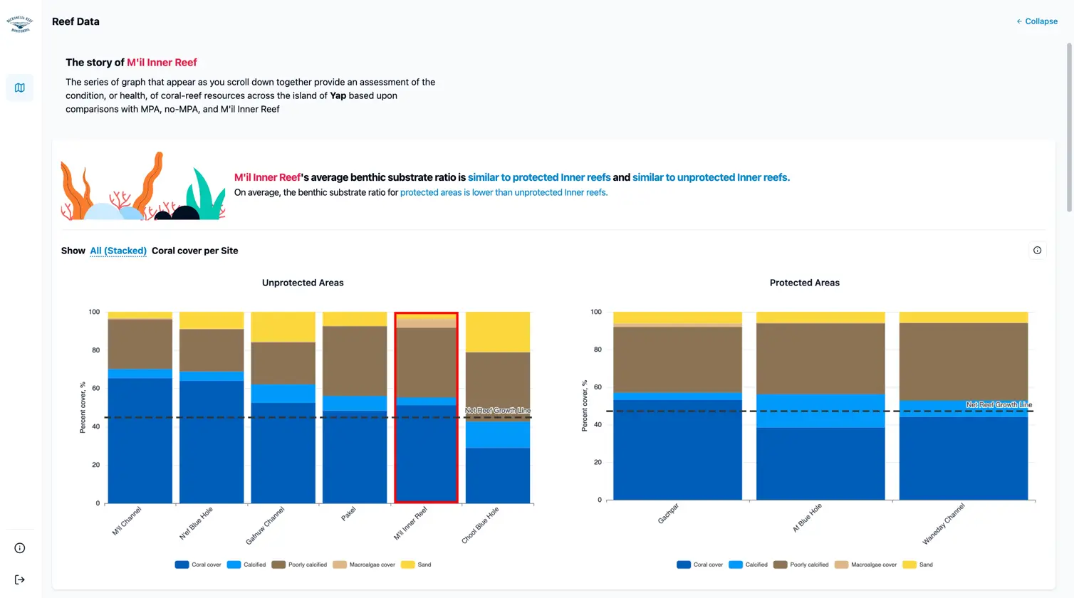
We introduced dual display modes—side-by-side and expanded—based on a suggestion from our client to better support two key use cases: comparing datasets across multiple sites, and conducting in-depth analysis of individual site data. This addition represents a meaningful enhancement to the platform’s usability. While the previous application offered valuable single-view charts, it didn’t include a side-by-side comparison mode. By introducing this feature, we made it easier for users to examine differences between locations at a glance.
In the default layout, the left panel renders the selected dataset (e.g., Coral or Bigfish) as soon as a site is clicked. This immediate visualization enables quick comparisons as users navigate through the map or site list.
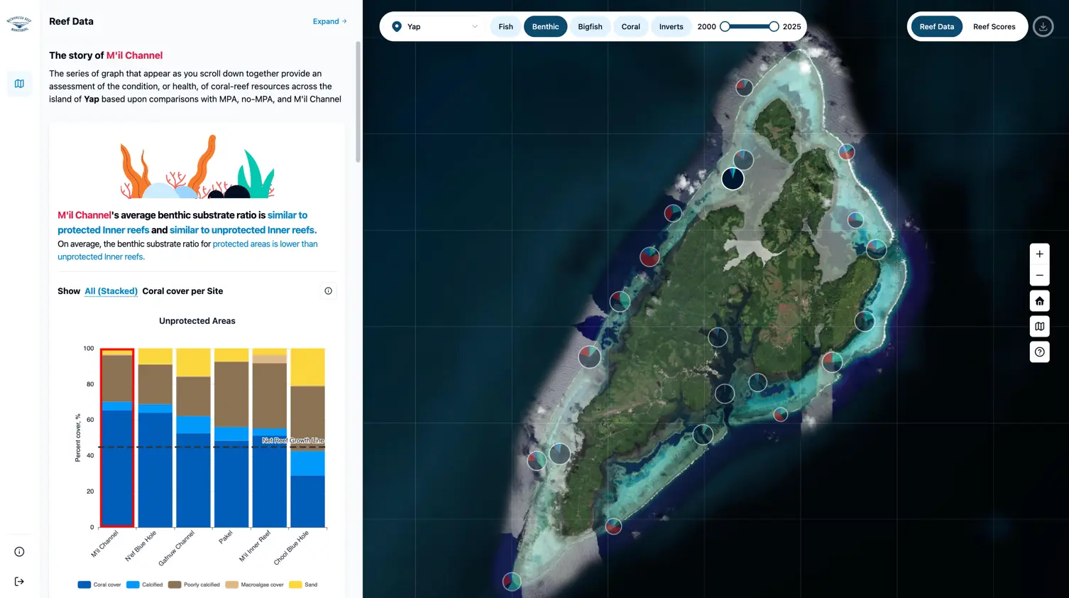
When a deeper dive is needed, users can switch to the expanded view, which presents the chart in full width—allowing detailed exploration of trends, patterns, and temporal changes without interface clutter.
🚀 Performance Upgrades
-
📦 Server-Side Data Handling (Amazon Lightsail): Complex data transformation was moved from browser to backend, minimizing client load and ensuring consistent output. This reduced frontend complexity and boosted reliability for data-heavy views.
-
🧠 Smart Client Caching: Frequently accessed datasets are now cached client-side, cutting API calls and improving load times during user navigation.
-
🔗 URL-Based State Management: Filters such as date range, island, and site are embedded in URLs to support direct navigation and fast prefetching:
https://app.micronesiareefmonitoring.com/dashboard/map/reef-data?island=Yap&reportType=fish&from=2008&to=2025&siteId=YAP-1
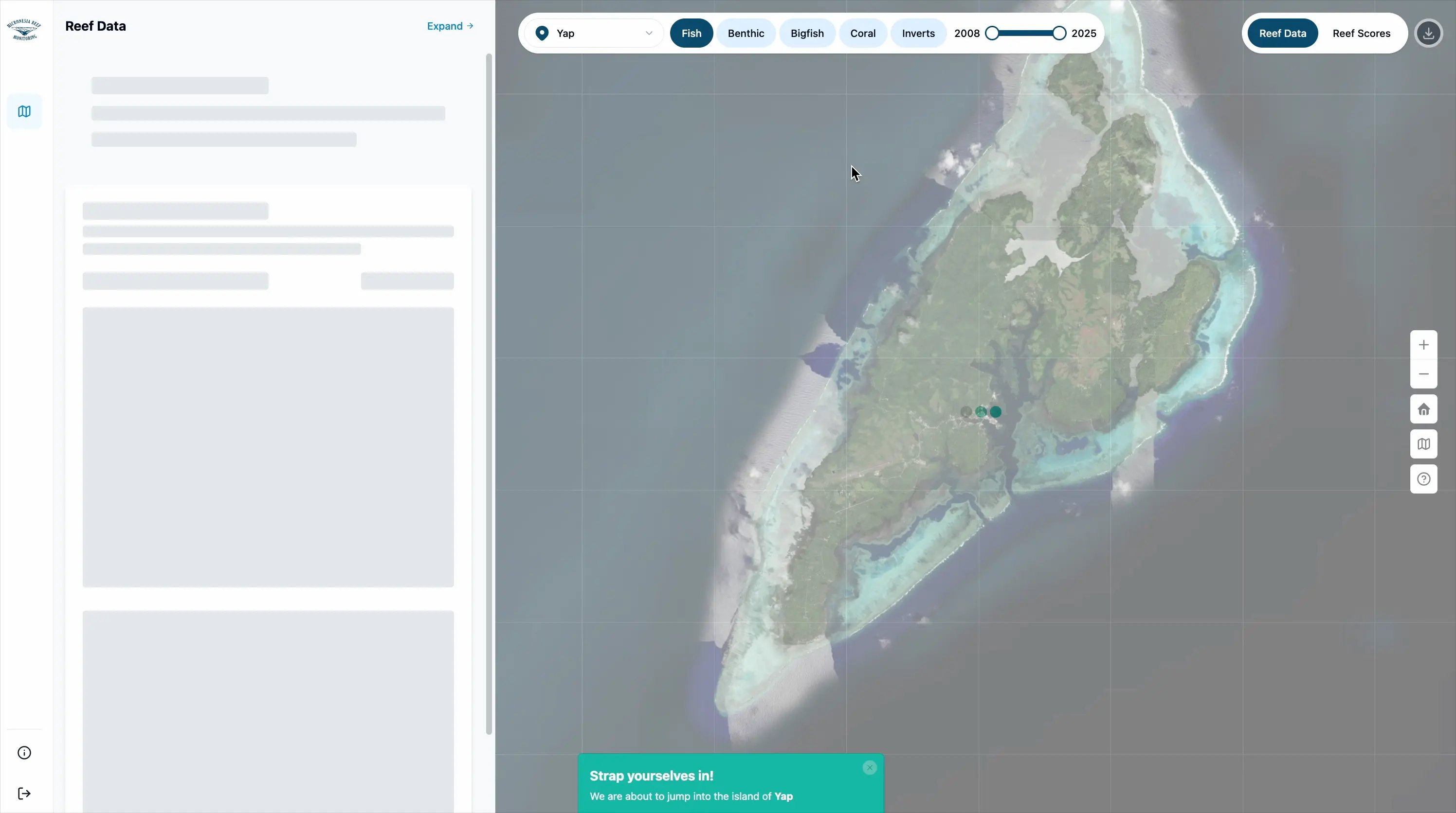
- 📉 Lazy Loading with React:
- React.lazy and Suspense allow deferred loading of charts.
- Skeleton loaders give users immediate visual feedback during fetch operations.
- 🔁 Optimized Rendering:
useMemoanduseCallbackwere used to reduce unnecessary re-renders and boost interaction performance in components like dropdowns and sidebar toggles.
🤝 Collaboration & Continuity
Throughout the project, we worked closely with the internal team to ensure the new designs and technical implementations aligned with the platform’s existing strengths.
We were particularly inspired by how the platform had already succeeded in bridging scientific complexity and user comprehension. Rather than changing the core, we focused on extending its usability, modernizing the frontend, and giving users a smoother path to the insights they already relied on.
“I've been looking at this for a couple days and very pleased. I love the rapid loading and visualization, such an improvement.” — Peter Houk, Principal Investigator, UOG Marine Lab and Micronesia Coral Reef Monitoring Network
Outcomes
📊 User Results:
-
Significantly faster load times, thanks to server-side data processing and client-side caching
-
Improved clarity and comprehension with redesigned charts, meaningful tooltips, and consistent contextual labels
-
Enhanced data exploration experience through side-by-side and expandable chart modes
-
Responsive UI optimized for reviewing data on tablets and laptops
👨💻 Codebase Maintainability Gains:
-
Cleaner component structure made the codebase easier to read, debug, and extend
-
Centralized state management reduced duplication and made application behavior more predictable
🌐 Final Reflections
This case study showcases the power of thoughtful modernization. By combining deep domain understanding with frontend innovation, we helped UOG Marine Lab and Micronesia Coral Reef Monitoring Network evolve their platform without losing the essence of what made it valuable.
We’re proud to have supported their mission—and we’re excited to continue building tools that turn scientific data into actionable insight.
📚 Explore more case studies from the Micronesia Reef Monitoring initiative here.